

Website design in 2026 is all about speed, sustainability, and smart technology. With AI-driven personalization, dark themes, and green hosting, web design is moving toward user-centered, environmentally responsible solutions. This guide explores 27 innovative trends shaping the next wave of digital experiences, from minimalist UI to motion storytelling, helping brands stay ahead in a fast-evolving online world where every second counts.
AI has evolved from a simple tool to become central to website design and development. This change marks one of the biggest shifts in web design trends: we now work alongside our tools instead of just using them. Web design trends for 2026 embrace environmentally responsible choices and user priorities in new ways. Mobile devices generate about half of all internet traffic, and nearly 70% of users prefer short videos to other content types. The digital world continues to change faster. Contact Dewbytes to build your brand’s online presence with fast-loading and best UI/UX designed websites.
This complete guide is about 27 effective website design trends that will shape 2026. These range from AI-powered interfaces to environmentally responsible choices, dark themes that minimize eye strain, and unique experiences that involve visitors. These trending website designs will help you be proactive, whether you plan to update your current site or build something new.
AI-Powered Web Design for any Organization
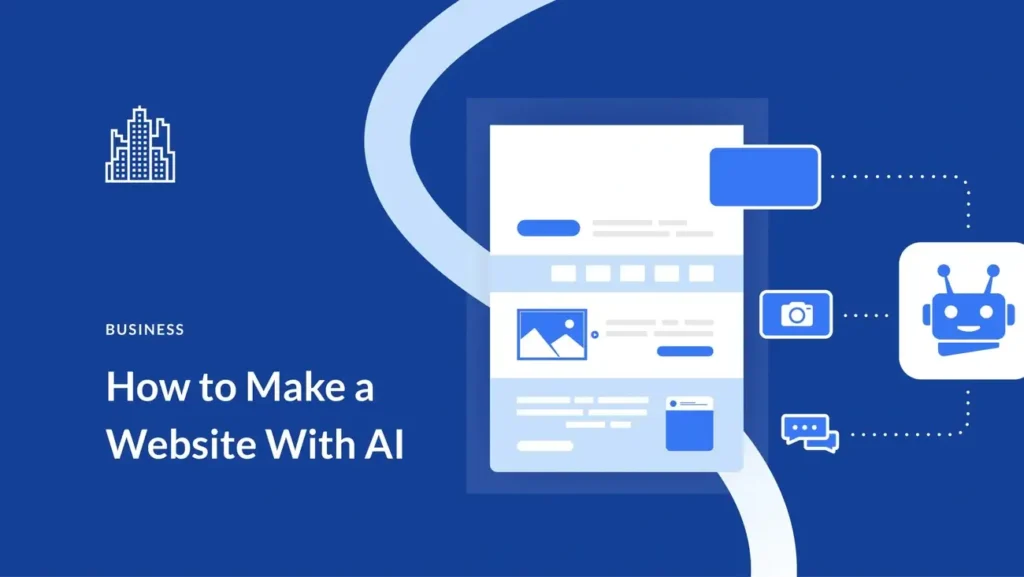
Image Source: Elegant Themes
AI drives modern web development today, with 93% of web designers using AI in their workflows. This change marks a new way to create digital experiences.
Key Features of AI in Web Design
AI brings new capabilities that reshape how we envision and build websites. AI web development tools use artificial intelligence to optimize and improve the entire web development process. The most effective features include:
Design assistance serves as the lifeblood of an AI application. Platforms offer design suggestions, optimize layouts, and enhance images to create stunning and user-friendly interfaces with minimal effort. AI algorithms analyze user data to improve website content, layout, and interactions for individual-specific experiences.
There’s another reason why AI matters – it provides practical SEO suggestions. AI can optimize web pages for search engines to boost visibility and drive more organic traffic. Search algorithms now understand natural language and context to deliver accurate results.
Pros and Cons of AI Tools
Understanding benefits and limitations is vital before starting your next web project:
Pros:
- Teams can focus on strategic work as AI handles routine tasks
- Better decisions through big data analysis and predictive analytics
- Market edge by using solutions that separate offerings and improve customer experiences
- Lower costs as AI tools streamline business operations
- Quick turnaround from concept to launch in under an hour
Cons:
- High startup costs require initial investments and training
- System integration poses technical challenges
- Data privacy raises concerns with large data volumes
- Fixed layouts limit customization options
- Results depend on AI accuracy, which might miss your creative vision
Best Use Cases for AI
AI shows its true value in specific areas that highlight its strengths:
AI-powered website builders like Wix ADI handle both design and development on one platform. They include AI features for image and text generation. Non-coders can type a description and get a website in seconds.
Personalization leads the way, as 80% of consumers choose companies offering individual-specific experiences. Websites adapt to user behavior and priorities in real-time. AI-driven recommendations suggest products based on previous choices.
Code assistance makes another valuable case. AI coding assistants reduce bugs, security issues, and poor code quality – with human oversight. Tools like Cursor write code with AI features that understand project context.
Tools to Implement in AI Website Design
Leading AI tools have emerged in web design:
GitHub Copilot leads AI-powered coding assistants. It helps developers code faster through AI prompts and suggestions. Wix ADI creates custom websites based on industry type, style preferences, and content needs.
Uizard offers AI-powered design tools for both beginners and professionals to create web and mobile app designs faster. Adobe Sensei in Creative Cloud improves images, handles repetitive tasks, and suggests smart edits.
Hotjar AI tracks user interactions like clicks, scrolls, and navigation to create heatmaps and session recordings. Applitools tests web applications across devices and browsers using visual AI.
AI in web design grows faster each day, making beautiful, functional websites available to everyone.
Retro and Bare-Bones Brutalism
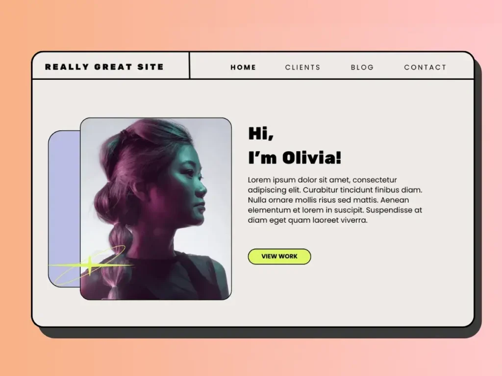
Image Source: Happy & Spice
The raw aesthetics of retro and brutalist designs are making a comeback in 2026. This design rebellion against polished minimalism gives us a fresh alternative to the “everything looks like a Notion doc” sameness that dominated recent years.
Key Features of Retro Design
Retro web design combines vintage aesthetics with modern functionality. It brings nostalgia while staying usable. The defining elements feature vibrant color schemes—neon pinks, electric blues, and bold yellows against black backgrounds create maximum contrast. Typography is a vital part with pixel fonts, chunky serifs, and groovy lettering that takes us back to earlier decades.
Visual elements that define retro designs include:
- Halftone patterns, grainy textures, and geometric shapes add depth
- Pixel art and low-fi graphics remind us of 90s gaming culture
- Vintage-inspired illustrations and retro iconography
- Film grain textures and analog wave forms create an authentic vintage feel
These designs don’t just copy the past. They reimagine retro elements through modern technologies—powered by CSS grid, responsive frameworks, and JavaScript micro-interactions.
Pros and Cons of Brutalism
Brutalism strips websites down to their skeletal framework with raw, unfiltered functionality. It makes a statement by rejecting the slickness of today’s websites through unstyled HTML elements, monochromatic color schemes, and simple navigation structures.
Pros:
- Creates memorable, distinctive experiences that stand out
- Loads faster due to minimal styling and smaller file sizes
- Puts focus on content without visual distractions
- Makes development simpler with fewer design elements
Cons: Brutalism has its drawbacks. Users who expect polished interfaces might feel alienated, and overly stark layouts can cause usability problems. Some brands don’t line up with a style that could look harsh or unfinished. People might see it as careless rather than intentional.
Best Use Cases
Retro and brutalist designs shine in specific contexts. Retro designs build emotional connections and work well for lifestyle, food, music, events, fashion, and gaming websites. B2B brands can add personality through typography choices or micro-animations without losing their professional edge.
Brutalism works best for independent creatives like artists, designers, and small studios. Brands that accept new ideas and rebellion can benefit from brutalist approaches. Personal projects such as portfolios, blogs, or experimental microsites can use brutalism without pushing users away.
Tools to Create Retro Esthetics
These distinctive styles are now available to more creators. Wix Studio offers retro design templates like Words on the Move or Excess Festival. You can customize them with pixel fonts, halftone images, grain textures, and subtle GIFs. Trickle’s 90s retro website builder gives you authentic templates with neon colors, pixelated graphics, and vintage typography.
Brutalist websites often go back to basics—using raw HTML, monospaced text, exposed interfaces, and blue hyperlinks. They focus on function over form and stand out clearly in today’s digital world.
Responsive 3D Experiences
Image Source: Designmodo
3D web experiences have evolved from novelty to necessity in 2026’s design landscape. Users now expect interactive, visually engaging content. Responsive 3D elements have become one of the most exciting website design trends. These experiences adapt naturally across devices while keeping both performance and visual quality intact.
Key Features of Responsive 3D
Several essential components combine depth and adaptability in responsive 3D web experiences:
Dynamic Canvas Scaling serves as the foundation of responsive 3D design. Developers use JavaScript to adjust the canvas size whenever the window changes. This helps the WebGL viewport adapt and maintain proper proportions across different screen sizes.
Relative Positioning helps 3D elements stay properly placed, regardless of the device. Much like 2D design uses relative CSS units, 3D experiences use relative positioning to keep objects and cameras from distorting.
Adaptive Camera Settings play a vital role in proper visualization. The camera’s aspect ratio must match changing viewport dimensions. This stops 3D elements from getting squished or stretched on different screens.
Auto-Zoom Functionality makes 3D models respond to viewport size changes. Your elements stay properly framed and visible on both desktop monitors and smartphone screens.
Pros and Cons
Pros:
- Better User Involvement: Interactive 3D elements can boost time spent on sites and encourage deeper brand connections
- Better Product Visualization: Users can explore products from every angle, which builds buying confidence
- Memorable Brand Experience: 3D websites leave a lasting impression compared to static alternatives
- More Conversions: Mediafly reports show interactive content gets more and thus encourages more engagement by 52.6% versus static content
- Storytelling Power: 3D elements help explain complex ideas in an immersive way
Cons:
- Performance Issues: High-quality 3D models need lots of resources and might slow down sites for users with limited bandwidth
- Mobile Optimization Challenges: Making responsive 3D work well on less powerful mobile devices needs extra optimization
- Learning Curve: Creating good 3D elements requires special tools and techniques
- Accessibility Issues: Complex 3D interfaces might be hard to use for some people, including those with disabilities
- Resource Demands: 3D elements and textures can affect performance if not optimized properly
Best Use Cases
Responsive 3D works best in specific situations where its strengths make the most impact:
Product Visualization leads the way by letting customers look at items from all angles before buying. This helps e-commerce sites selling furniture, clothing, or tech products.
Interactive Storytelling uses 3D to create immersive stories that guide users through content. Companies can explain complex services or show their history this way.
Portfolio Enhancement helps creative professionals stand out by expanding beyond traditional grid layouts. This creates a guided tour that shows work more effectively.
Educational Demonstrations benefit from 3D’s power to show complex concepts through hands-on models. This makes learning more natural and interesting.
Tools to Build 3D
Several powerful platforms make responsive 3D creation easier:
Three.js remains the lifeblood of 3D web development. This high-level framework uses WebGL for hardware-accelerated rendering. Its detailed documentation and community support make it available to new 3D developers.
Spline provides a no-code browser-based solution. Designers can create 3D objects with interactive features and export them straight to websites. State Transitions and Screen Resize Events make responsive design simple.
Vectary changes how teams create and share 3D designs through its browser platform. The platform makes shared 3D creation possible without downloads and offers simple website embedding.
Dora adds animation features to 3D experiences through its no-code platform. Its drag-and-connect constraint layout system makes responsive 3D simple. Designers can create complex scroll animations without coding.
Blender offers powerful 3D modeling features that work on the web. This free, open-source software helps create detailed 3D assets for complex interactive experiences.
Browsers keep getting better, and responsive 3D experiences will keep evolving. This offers more immersive ways for brands to connect with audiences on any device.
WebGL for Everyone
Image Source: The Web Factory
WebGL technology has become a mainstream web design tool in 2026, moving beyond its roots as a developer specialty. This JavaScript API now serves as the lifeblood of modern web experiences and powers everything from immersive product views to interactive data displays in all modern browsers.
Key Features of WebGL
WebGL (Web Graphics Library) is a JavaScript API that renders high-performance interactive 3D and 2D graphics in compatible web browsers without plugins. The technology works by using an API that matches OpenGL ES 2.0 and runs within HTML canvas elements.
These notable features have made WebGL popular:
Hardware Acceleration lets WebGL use the user’s GPU to render complex graphics substantially faster than traditional methods. This speed boost makes previously impossible web experiences smooth and practical.
Cross-Platform Compatibility makes WebGL work the same way across operating systems and devices. Users can access advanced graphics without special hardware or software installations.
WebGL 2.0 Support now runs on all major browsers with better features based on OpenGL ES 3.0. Users get 3D textures, uniform buffer objects, and multiple render targets.
Pros and Cons
Pros:
- Enhanced Graphics Performance delivers better 3D graphics than HTML and CSS methods
- No Installation Requirements, let users run WebGL apps straight from browsers
- Automatic Updates happen on the server, so users always have the latest version
- Unified Development Environment uses standard web technologies to make development easier
Cons: Older computers with outdated graphics hardware might struggle with complex WebGL applications due to Hardware Dependence. Bandwidth Requirements can be high for detailed graphics or up-to-the-minute data analysis, which causes issues in areas with poor internet. The Development Complexity means developers need special graphics programming knowledge to create fast WebGL applications.
Best Use Cases
WebGL shines in specific areas where its strengths make the biggest difference:
E-commerce gets great benefits from interactive 3D product models. Customers can rotate, zoom, and get into items as if they were in a store. This feature boosts the shopping experience for furniture, clothing, and tech products.
Data visualization is another perfect fit. WebGL helps explore large datasets through interactive 3D visualizations that show trends as they happen. Complex information becomes more available and useful.
Gaming has embraced WebGL to create immersive, high-performance games that run in browsers. These games offer sophisticated experiences without extra downloads, unlike older browser games that needed plugins.
Tools to Use WebGL
Developers can choose from several powerful libraries to make WebGL easier:
Three.js remains the lifeblood of WebGL development with its high-level JavaScript framework that simplifies many complex tasks. New developers can start with 3D graphics thanks to great documentation and community support.
Babylon.js provides a complete JavaScript framework to build 3D games with HTML5, WebGL, and Web Audio. The framework has collision detection, physics, and audio engines built in.
PlayCanvas combines an open-source game engine with cloud-based development that lets teams edit together in real-time. This setup makes team development of interactive experiences faster.
A-Frame makes things simpler by wrapping Three.js and WebGL in HTML custom elements. Developers can create VR experiences that work on desktop, iOS, Android, and VR headsets more easily.
Micro-Animations with Purpose
Image Source: DepositPhotos Blog
Small movements can affect user experience in powerful ways. Micro-animations have become one of the most important website design trends for 2026. These quick, focused animations combine smoothly with a product’s UX. They improve navigation paths and bring data to life, which makes interfaces more responsive and user-friendly.
Key Features of Micro-Animations
Micro-animations excel at showing system status through light visual signals that guide users through software at crucial points. They boost the user’s feeling of direct control and help people see their actions’ results. These tiny movements work as visual confirmations whenever users interact with the system.
Effective micro-animations have four main parts: triggers (events that start the interaction), rules (logic that controls how things unfold), feedback (what users see as a response), and loops/modes (how interactions play out over time). A button click shows this well – the trigger sets off rules that determine the button’s response and gives instant visual feedback.
Pros and Cons
Pros:
- Shows instant visual feedback that confirms user actions
- Cuts down uncertainty and frustration during loading times
- Makes websites easier to use by showing what elements do
- Stops errors by giving advanced guidance
- Adds personality to brands and creates memorable moments
Cons: Too many animations can overwhelm users and pull attention from the main content. Slower devices might struggle with performance, which slows down interfaces. Designers face the challenge of balancing creativity with function – animations must serve a purpose without hurting usability.
Best Use Cases
Toggle switches work better with micro-animations that show when they turn on or off. Progress bars and loading screens keep users interested while they wait. Research shows users stick around for 22.6 seconds with progress bars, compared to just 9 seconds without any feedback.
Forms become more useful with subtle animations that help fix errors. A field might give a quick “shake” for wrong input, much like shaking your head no. Online stores use animations effectively to show when items go into shopping carts.
Tools to Add Micro-Animations
Adobe After Effects leads the pack as designers’ favorite tool for custom micro-animations. CSS animations offer simpler options for basic interactions like button hovers. LottieFiles helps designers create animations in Adobe After Effects and turn them into lightweight JSON files that fit easily into websites.
JavaScript libraries like GreenSock (GSAP) or Anime.js give advanced control over complex animation effects. Phase works much like Figma but with simpler tools, which makes creating animations possible even for those who aren’t animation experts.
Kinetic and Moving Typography
Image Source: Piktochart
Kinetic typography—animated text that brings typography to life through movement—leads the website design trends for 2026. The film industry popularized this dynamic approach in the 1960s, and it has become vital to modern design.
Key Features of Moving Type
Moving type improves clarity, emotion, and messaging through thoughtful motion. Design theorist Barbara Brownie’s research points to three primary styles that are the foundations of this technique:
- Fluid Typography: Letters morph and change while remaining stationary, creating a visual transformation without crossing the screen
- Scrolling Typography: Text elements move across a plane – horizontally, vertically, or even in 3D space
- Dynamic Layout: Text elements move in relation to each other, creating visual relationships and hierarchies
Your message’s success depends on timing. Even the most creative animation fails without perfect readability of the text.
Pros and Cons
Pros:
- Grabs attention in the vital first three seconds
- Message clarity improves through motion emphasis
- Visual storytelling creates stronger emotional bonds with viewers
- Helps retain and understand information better
- Adds a unique personality to digital experiences
Cons:
- Page loading speeds might suffer
- Poor implementation can distract users
- Users with vestibular disorders may face accessibility issues
- More design and development resources are needed
- Some devices or browsers might display content incorrectly
Best Use Cases
Marketing campaigns and bold branding use this technique to capture audience attention. Students learn better with animated text’s improved comprehension. Text movement adds emotional depth to films, music videos, and interactive websites.
Tools to Animate Text
Text animation has become simpler with these powerful tools:
- Adobe After Effects leads the industry with precise text animation control
- Filmora makes 2D and 3D text animation user-friendly with drag-and-drop features
- Animaker offers custom templates and team collaboration through cloud storage
- PowToon excels in animated presentations with text effects
Web developers can use CSS animations for simple text movements. The GSAP library provides advanced control for complex typography animations.
Sound in Web Design
Image Source: Veza Digital
Sound has become the overlooked aspect of web design. Research shows it can reshape static websites into immersive, multisensory experiences. The latest website design trends for 2026 show that strategic audio use can boost user participation by a lot. Studies confirm that sound awakens emotions and boosts message retention.
Key Features of Sound Design
Website interfaces use sound for multiple purposes beyond decoration. Users receive functional sounds as feedback that confirm actions like button clicks or form submissions. Notification sounds keep users informed about important events or completed processes. The atmosphere and brand identity benefit from ambient sounds that create emotional connections that visual experiences cannot match.
Audio design works best with two main approaches: skeuomorphic sounds that copy real-life actions and abstract sounds that evoke specific emotions. Sound duration plays a vital role in whatever the style. Feedback sounds should last just slightly longer than their associated micro-animations, ideally under 0.3 seconds.
Pros and Cons
Pros:
- Creates memorable brand experiences by triggering emotional responses
- Makes interfaces more accessible through audio cues for visually impaired users
- Reduces uncertainty by confirming user actions
- Helps users retain and absorb information better
- Adds character and depth to user interfaces
Cons: Unwanted sound can violate personal space in public settings. Page load times slow down because sound increases page weight—users abandon pages that take longer than 3 seconds to load. Poor sound implementation risks overwhelming users who already experience sensory stimulation from other sources.
Best Use Cases
Notifications and alerts need sound to grab attention quickly for important updates or completed actions. Audio elements make interactive feedback more effective by confirming user actions like form submissions or successful transactions. Brand stories and immersive experiences gain emotional depth through sound.
Tools to Add Audio
Web Audio API provides standard functionality across browsers. Howler.js offers cross-browser support and useful audio features while keeping file sizes small. Tone.js works great for creative sound applications with its advanced scheduling capabilities and musical abstractions. BBC’s R&D department’s R-audio gives React components an accessible interface to Web Audio.
The Human Layer in UX
Image Source: Medium
The digital world of 2026 reveals a simple truth beyond AI and automation buzz. The most influential website design trends acknowledge that technology without human touch simply doesn’t work. Human-centered design serves as a significant balance to our automated tools.
Key Features of Human
Human-centered design builds on four principles that raise websites from basic function to real meaning:
- People-centered approach that puts user needs, emotions, and contexts first throughout design
- Understanding root problems instead of quick fixes for surface issues
- Systems thinking that sees how everything connects
- Iterative testing through small changes before expanding solutions
This approach draws its strength from empathy. Understanding users’ feelings shapes every design choice. The challenge lies in balancing AI efficiency with human creativity. As one design expert notes, “While AI brings exceptional efficiency, it is human creativity and empathy that make design truly appeal to users”.
Emotionally intelligent design builds experiences that recognize and respond to users’ emotions. Users experience warm, personal connections instead of cold transactions.
Your website’s evolution needs this perfect mix of human touch and technology. Dewbytes helps build your brand’s online presence with fast-loading and best UI/UX designed websites that blend technical excellence with human insight.
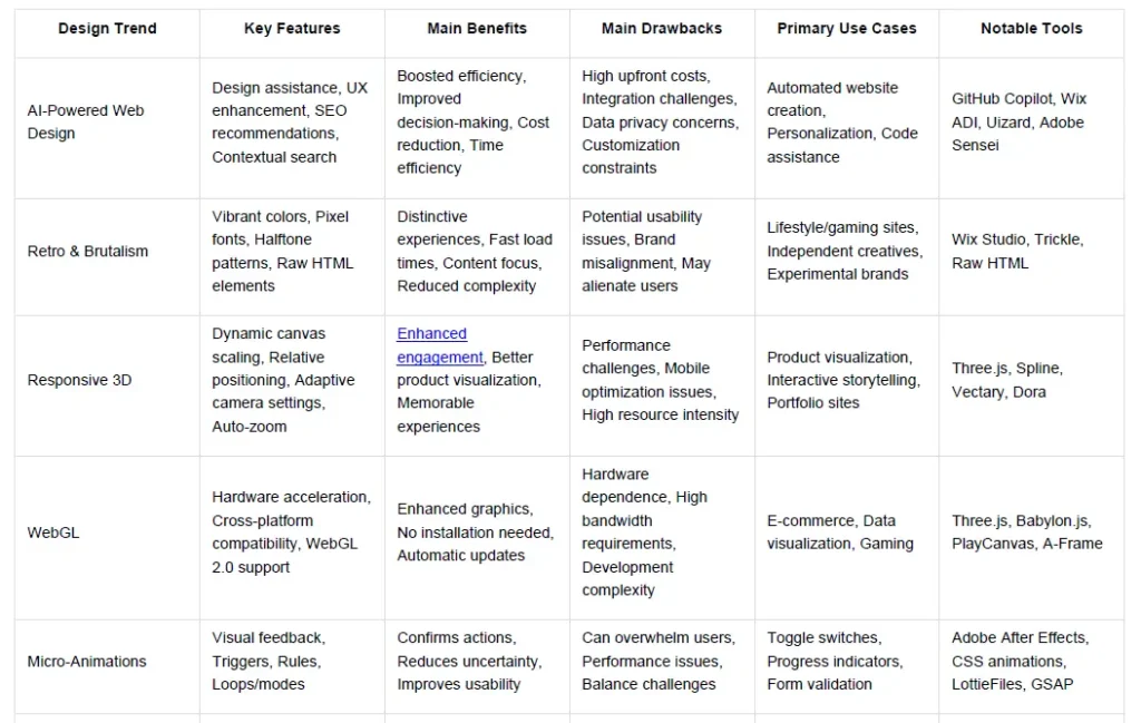
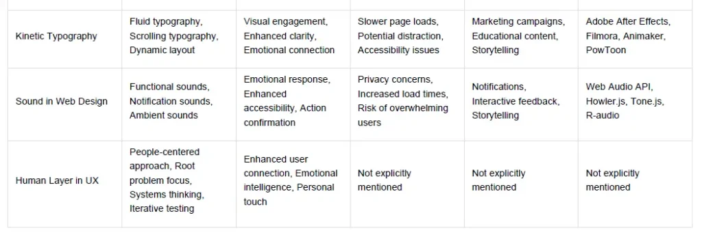
Comparison Table
Key Takeaways
These 27 website design trends for 2026 reveal a fascinating balance between cutting-edge technology and human-centered experiences that will define the next generation of web design.
• AI integration is now essential, not optional – 93% of web designers already use AI tools for automated design assistance, personalization, and SEO optimization to boost efficiency and competitive advantage.
• Retro esthetics and brutalism offer bold alternatives – Vibrant 90s-inspired designs and stripped-down brutalist approaches create memorable, distinctive experiences that stand out from generic minimalism.
• 3D and WebGL experiences are becoming mainstream – Responsive 3D elements and WebGL technology enable immersive product visualization and interactive storytelling across all devices without plugins.
• Micro-animations serve strategic purposes beyond decoration – Purposeful small movements provide crucial user feedback, reduce uncertainty, and guide users through interfaces while confirming their actions.
• Sound design adds the missing sensory dimension – Strategic audio implementation creates emotional connections and enhances accessibility, though it requires careful balance to avoid overwhelming users.
• Human-centered design remains the crucial counterbalance – Despite technological advances, empathy-driven design that prioritizes user emotions and contexts ensures digital experiences feel personal and meaningful.
The most successful websites in 2026 will masterfully blend these technological capabilities with genuine human understanding, creating experiences that are both innovative and emotionally resonant.
FAQs
Q1. How is AI changing web design in 2026?
AI is revolutionizing web design by automating tasks, providing design assistance, enhancing user experiences, and offering SEO recommendations. It’s boosting efficiency and productivity while enabling more personalized and data-driven design decisions.
Q2. What are some key features of responsive 3D experiences in web design?
Responsive 3D experiences include dynamic canvas scaling, relative positioning, adaptive camera settings, and auto-zoom functionality. These features ensure 3D elements adapt seamlessly across different devices while maintaining visual quality and performance.
Q3. Why is the “human layer” important in UX design?
The human layer in UX design focuses on creating emotionally intelligent and empathetic experiences. It prioritizes understanding user needs, emotions, and contexts, ensuring that websites feel personal and meaningful despite increasing automation and AI integration.
Q4. How are micro-animations being used in website design?
Micro-animations are being used to provide visual feedback, confirm user actions, and guide users through interfaces. These subtle movements improve usability, reduce uncertainty, and add personality to websites without overwhelming the user experience.
Q5. What role does sound play in modern web design?
Sound in web design serves multiple purposes, including providing functional feedback, notifications, and creating an ambient atmosphere. When used strategically, it can enhance user engagement, improve accessibility, and create more memorable brand experiences.

Azahar Hussain
Founder, SEO Specialist & WordPress Developer
Azahar Hussain is a digital marketing professional, SEO specialist and WordPress developer based in Guwahati, Assam, India. He is the founder of Dewbytes, a digital marketing and web development agency serving businesses across India and international markets.
With an MCA (Master of Computer Applications) degree and more than 12 years of experience in IT, networking, website development and search engine optimization, Azahar Hussain specializes in building technically optimized digital platforms focused on long-term business growth.
Professional Expertise
Search Engine Optimization & Technical SEO
Azahar Hussain specializes in search engine optimization, technical SEO, local SEO and international SEO strategies designed to improve search visibility, website performance and long-term organic growth.
WordPress Development & Website Optimization
As a WordPress developer, he focuses on building technically optimized, user-friendly and search-engine-ready websites that support business growth and better user experience.
Digital Marketing & Lead Generation
His work includes digital brand development, lead generation systems, content strategy, website optimization, and performance-focused digital marketing campaigns.
Professional Experience
Industry & Client Experience
Over the years, Azahar Hussain has worked with businesses across multiple industries, including local businesses, healthcare, education, real estate, technology, e-commerce and professional services.
Regional & National Presence
Based in Guwahati, Assam, he has extensive experience working with businesses across North-East India while also serving clients throughout India and international markets.
Approach to Digital Strategy
Data-Driven Growth Strategies
His approach focuses on practical, long-term digital strategies based on technical optimization, audience behaviour analysis and sustainable search growth rather than short-term ranking tactics.
Technical & Business-Focused Solutions
By combining website development expertise with SEO implementation, he helps businesses build digital platforms that support both visibility and performance.
Association with Dewbytes
Founder & Strategic Leadership
As Founder of Dewbytes, Azahar Hussain oversees:
- SEO strategy and implementation
- Website architecture and optimization
- Technical audits and performance improvements
- Content and search visibility planning
- Digital campaign strategy
The agency provides services related to website development, SEO, digital marketing and online brand growth.
Areas of Expertise
Core Skills & Specializations
- Search Engine Optimization (SEO)
- Technical SEO
- WordPress Development
- Website Design & Optimization
- Local & International SEO
- Digital Brand Development
- Website Performance Optimization
- Lead Generation Strategies
- Content Strategy
- Digital Advertising Campaigns
Professional Profiles & Social Presence
Official Social Profiles
- LinkedIn:
Azahar Hussain LinkedIn - Facebook:
Azahar Hussain Facebook - Instagram:
Azahar Hussain Instagram - X (Twitter):
Azahar Hussain on X
Contact Information
Professional Contact Details
📍 Guwahati, Assam, India
🌐 Dewbytes Official Website
📧 azrarn786@gmail.com
📞 +91 7002763122


